Data Tuesday: 20 Years of US Elections
Reason #1000 dot maps are a superior format
Summary: The author advocates for dot maps as a superior method for visualizing US presidential election results from 2000-2020, arguing they overcome two critical flaws in traditional election cartography. Traditional red-blue maps misrepresent America as uniformly one color while obscuring significant minority party support even in partisan strongholds; graduated color schemes similarly fail to show population distribution. Dot maps solve both problems by representing each 1,000 voters as a single dot, revealing both political diversity and the true concentration of the electorate in urban areas.
In my quest to get people to use more dot maps, I’ve decided to show a third example where I think the style is uniquely good. Namely, the U.S. election presidential election results for 2000-2020. Currently I think election maps in the US have two issues.
First, they tend to show America as a “red” vs. a “blue” country. With maps like this:
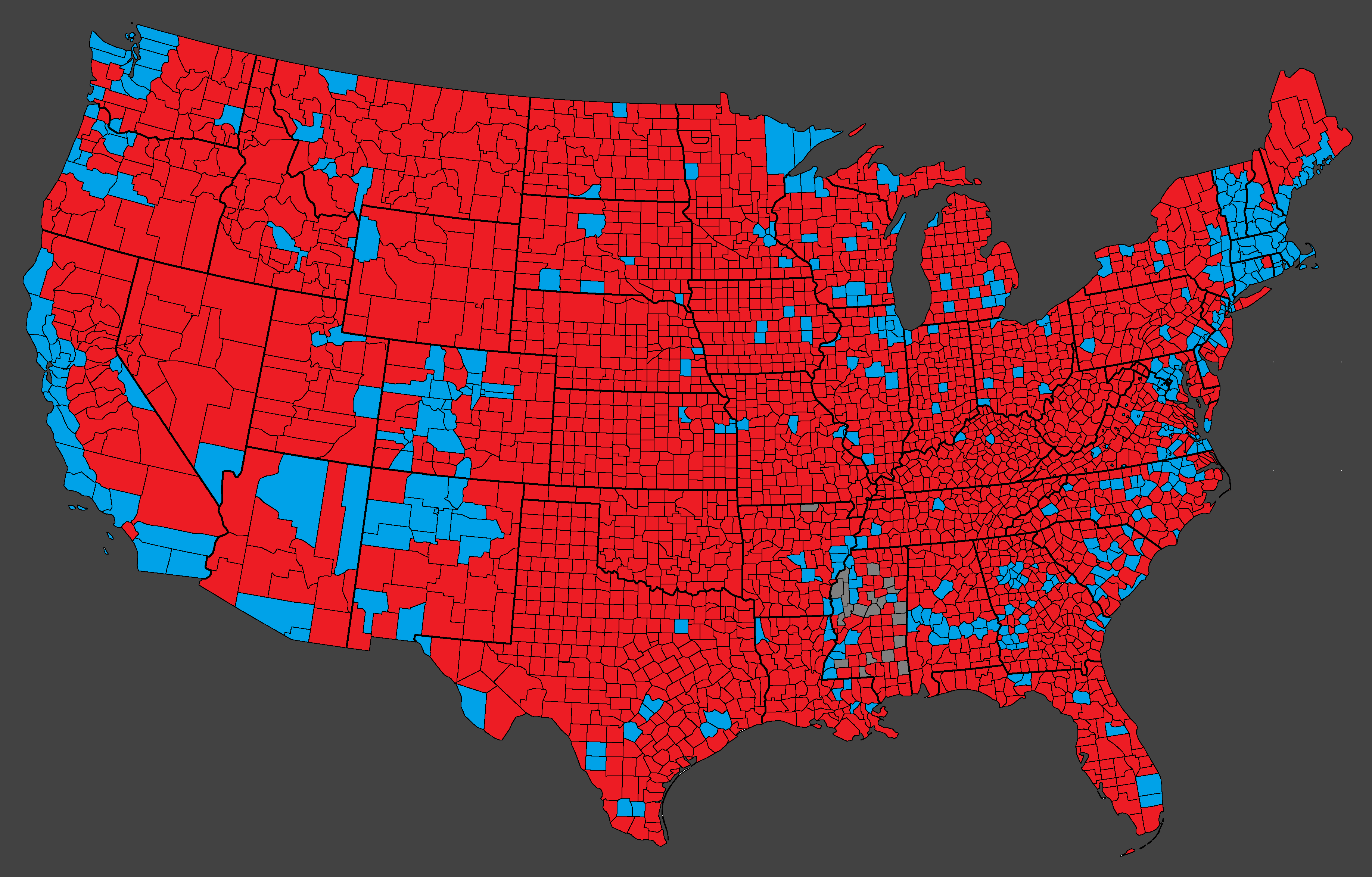
There is, of course, a grain of truth to these maps, but they also obscures the fact that even in the most partisan parts of this country you still have significant numbers of voters from both parties.
But even if you fix this and have a more graduated color map like this one:
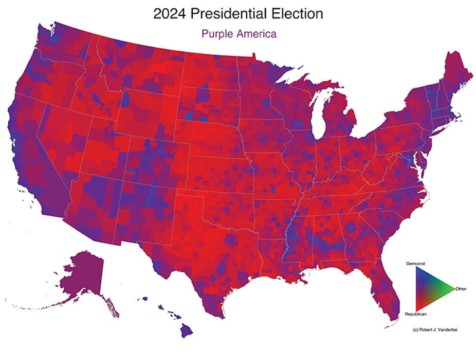
You still fail to communicate where the electorate actually lives!
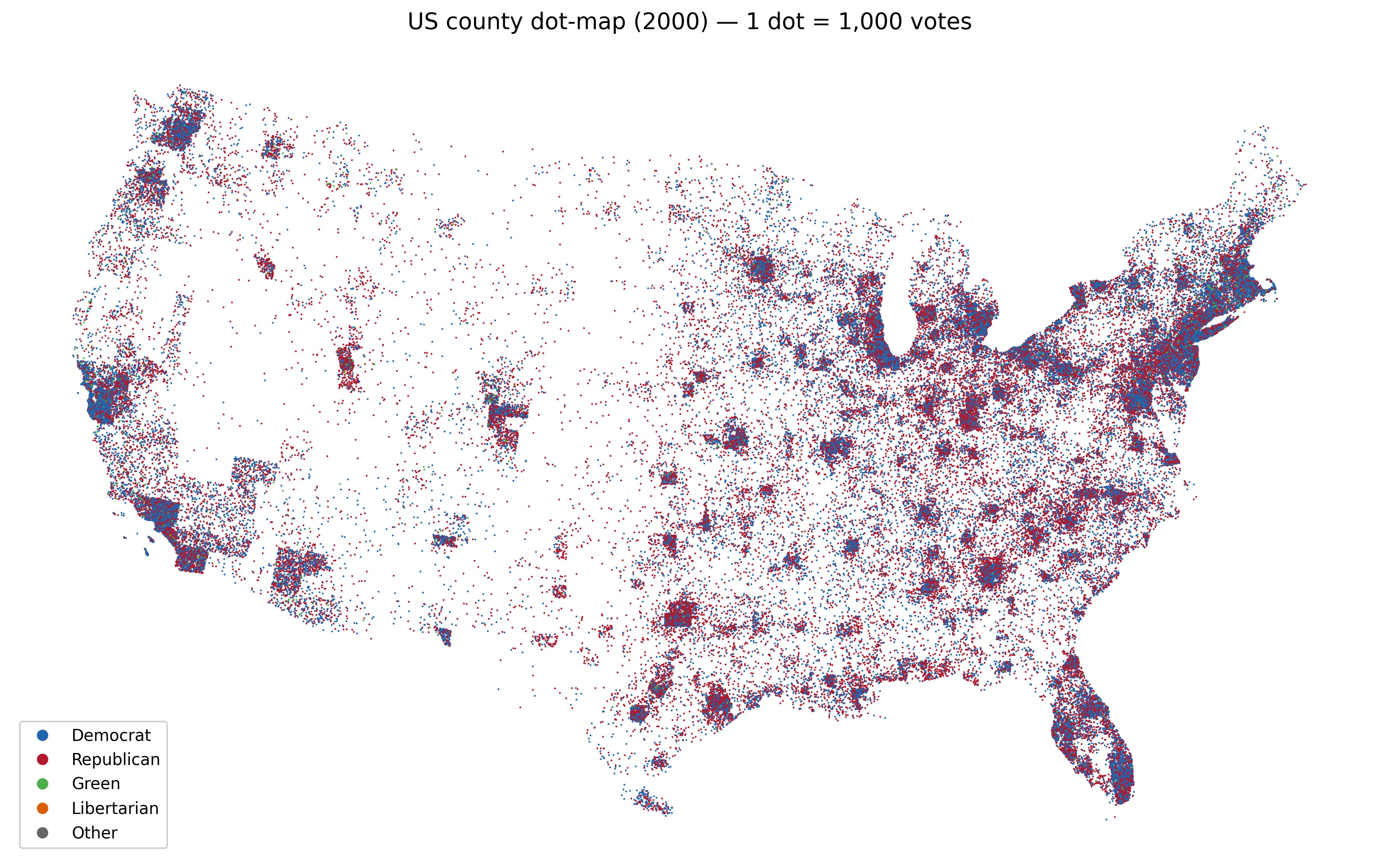
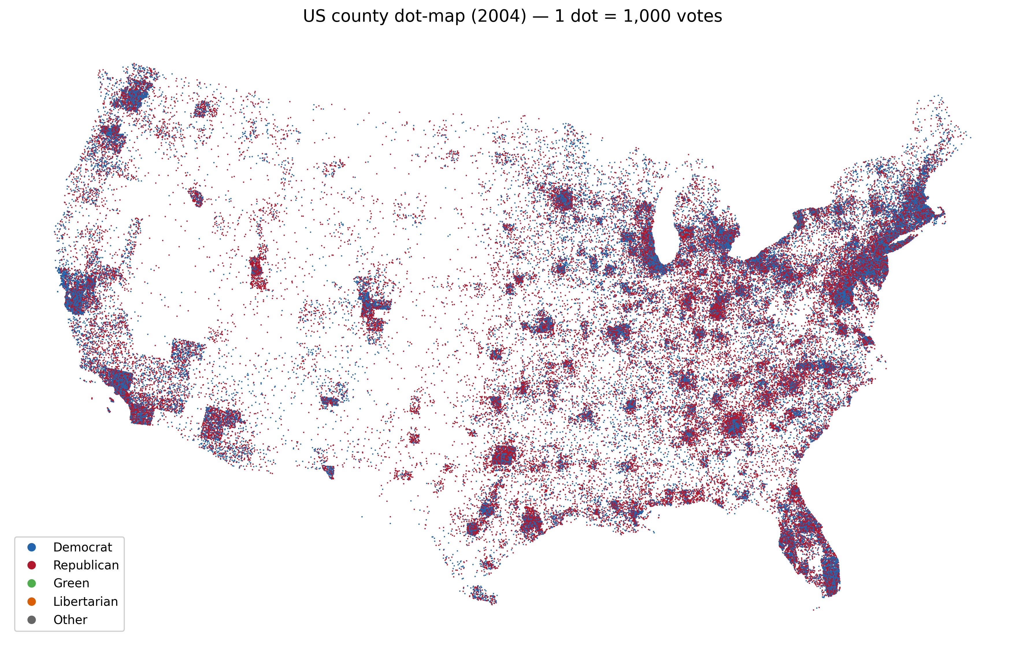
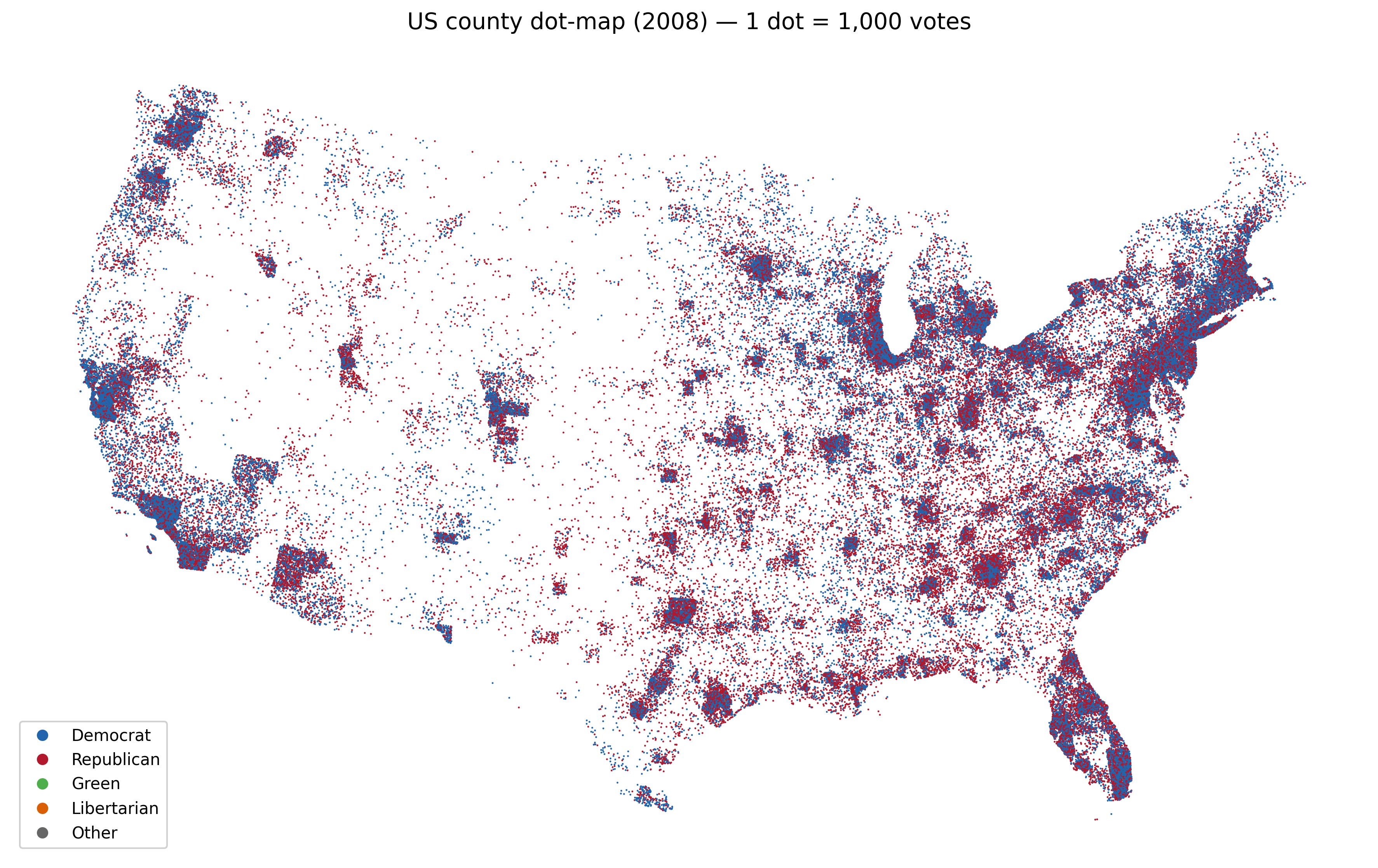
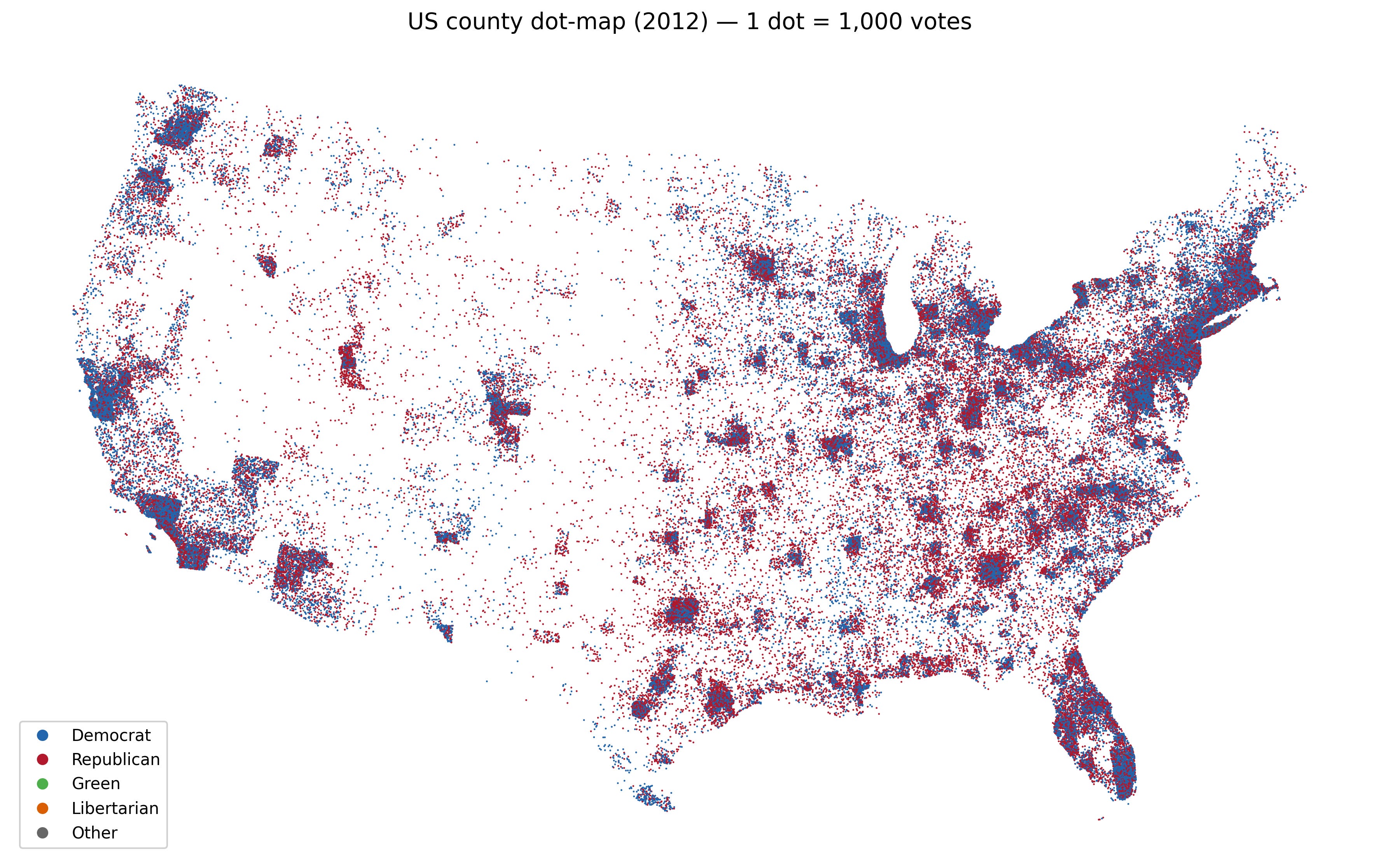
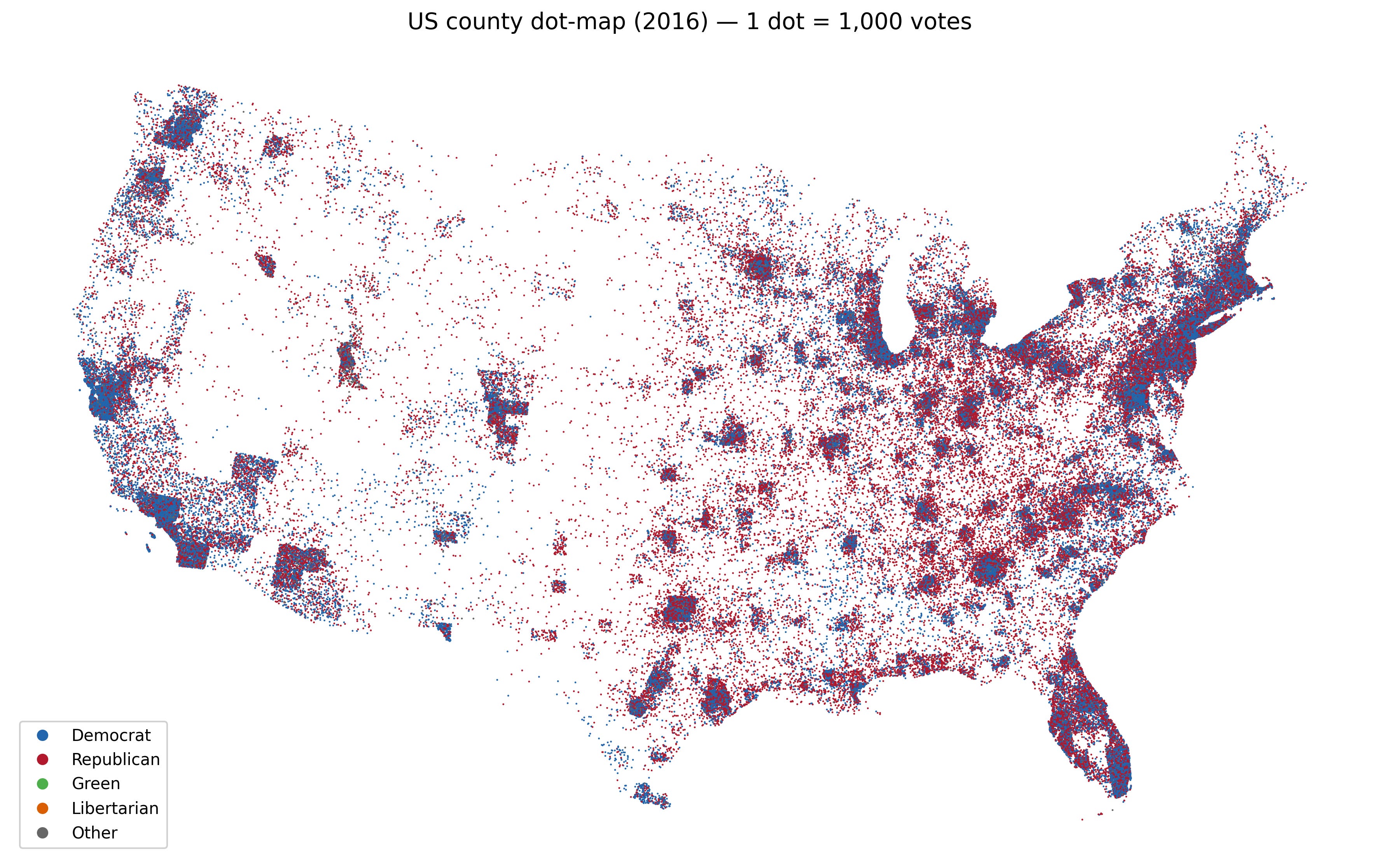
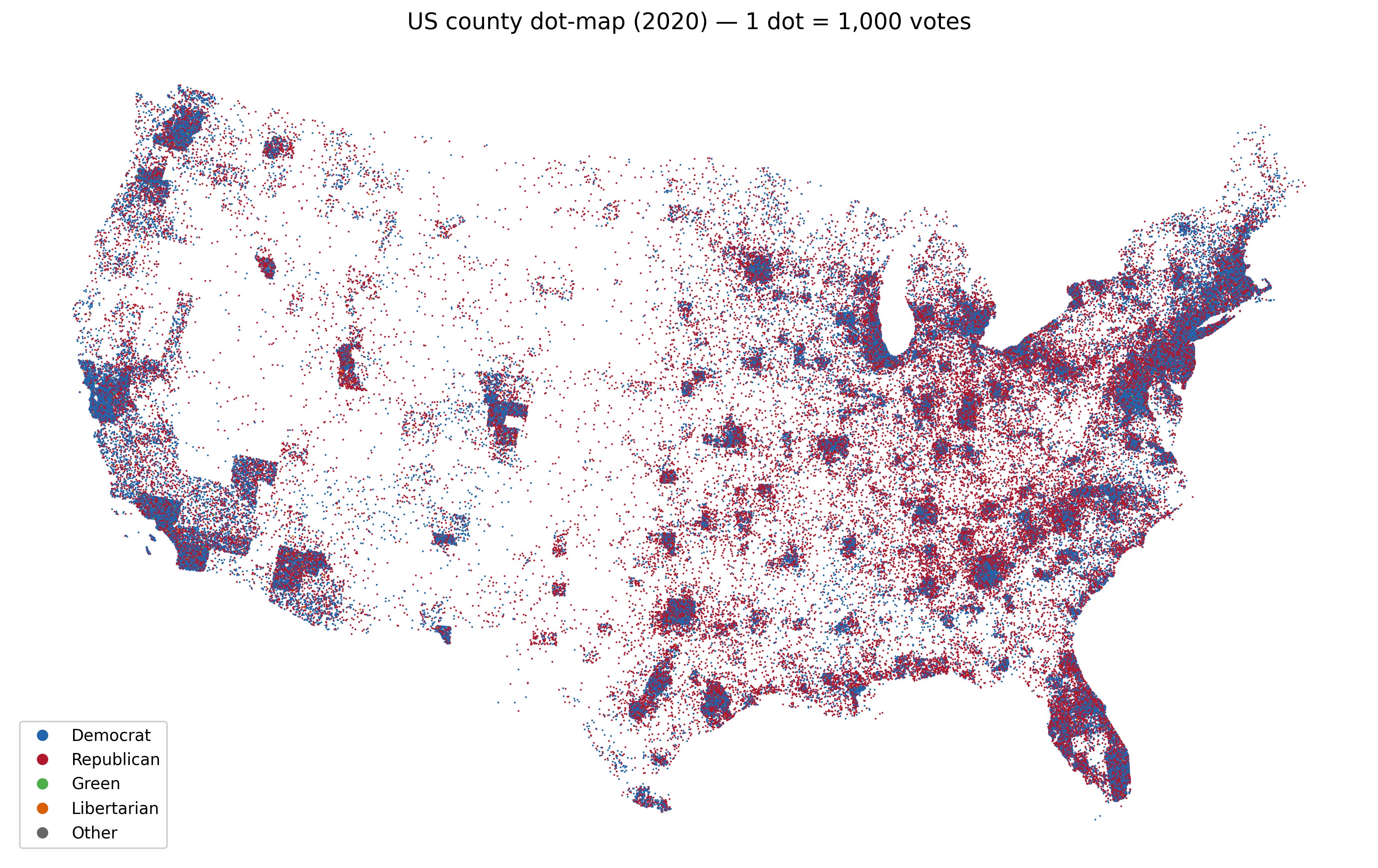
Well, luckily the dot map once again solves all of these problems.
This data was collected from the MIT Election Dataset. They have updated data from 2000–2024; however I’m using an earlier download of just the data through 2020.
Each dot represents 1,000 people. I found this to be a sweet spot, nevertheless it still underreports the true size of urban voters, their dots are overlapping. Since we have a bias to smaller rural states in the electoral college I think this is mostly okay. I have written the code so that it attempts to match the distribution of votes in the city visually, thus color accurately communicates the proportionality even if dots are overlapping.
For $5/month or $50/year, you'll gain access to all my paywalled articles and earn a permanent spot in my heart.
Alternatively you can support me via buymeacoffee or by shopping on amazon while using my affiliate link1
It is that easy to support me!